How to use graphics to try complex cases
If you’re getting serious about creating powerful presentations, a great resource to reference is Edward Tufte’s influential book, The Visual Display of Quantitative Information. In his chapter on what he calls “graphical excellence” are several takeaways that we regularly leverage when creating graphics for to explain quantitative or complicated information:
First, “show the data”: Once made sensitive to this, you can never look at a chart or graph again without noticing whether the author/artist is doing so. Clearly labeling the values, x- and y-limits, units, and citing to source convey important information. Just as importantly, these detailed bits are what I call indicia of authenticity in that they communicate a degree of care that suggests truth and precision. That is the impression you want to create when submitting a report or presenting at trial.

Here, we combine a timeline, a graph and an illustration, creating a single visual. This supported discussion of the thickness and weight of asphalt, which over years built up on the road surface of a highway bridge. It catastrophically failed.
Second, "induce the viewer to think about the substance": This tenant is as opposed to thinking about what technique or enhancement the artist is using. The technique used to present the data should be consistent with the nature of the data and the takeaway you are offering your audience. The gift is your message, not the wrapping paper.
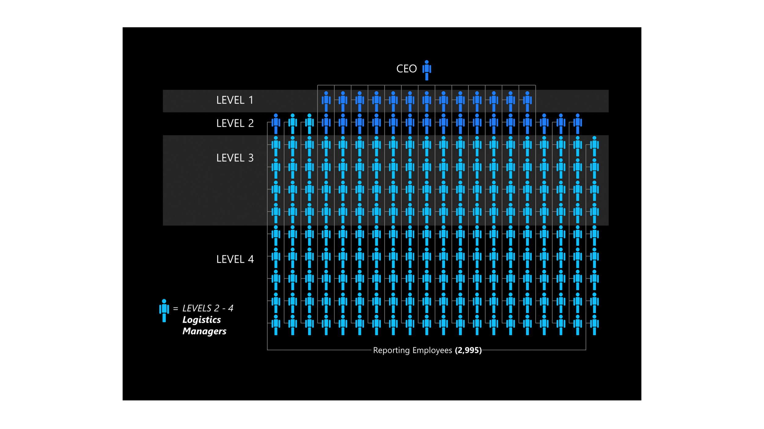
The simple use of iconography can help maintain viewers’ focus on the subject matter at hand. Here, for example, we see not just numbers, but numbers of people.
And third, “don’t distort what the data has to say”: This one is crucial for lawyers, their experts and artists to adhere to scrupulously. While that seems obvious, experience shows that it bears repeating. The consequences of misrepresenting data are so dire, one would think it would never happen, but regrettably it does. This has given us more than one opportunity to create corrected versions of opponents’ graphics for our clients to use on cross.
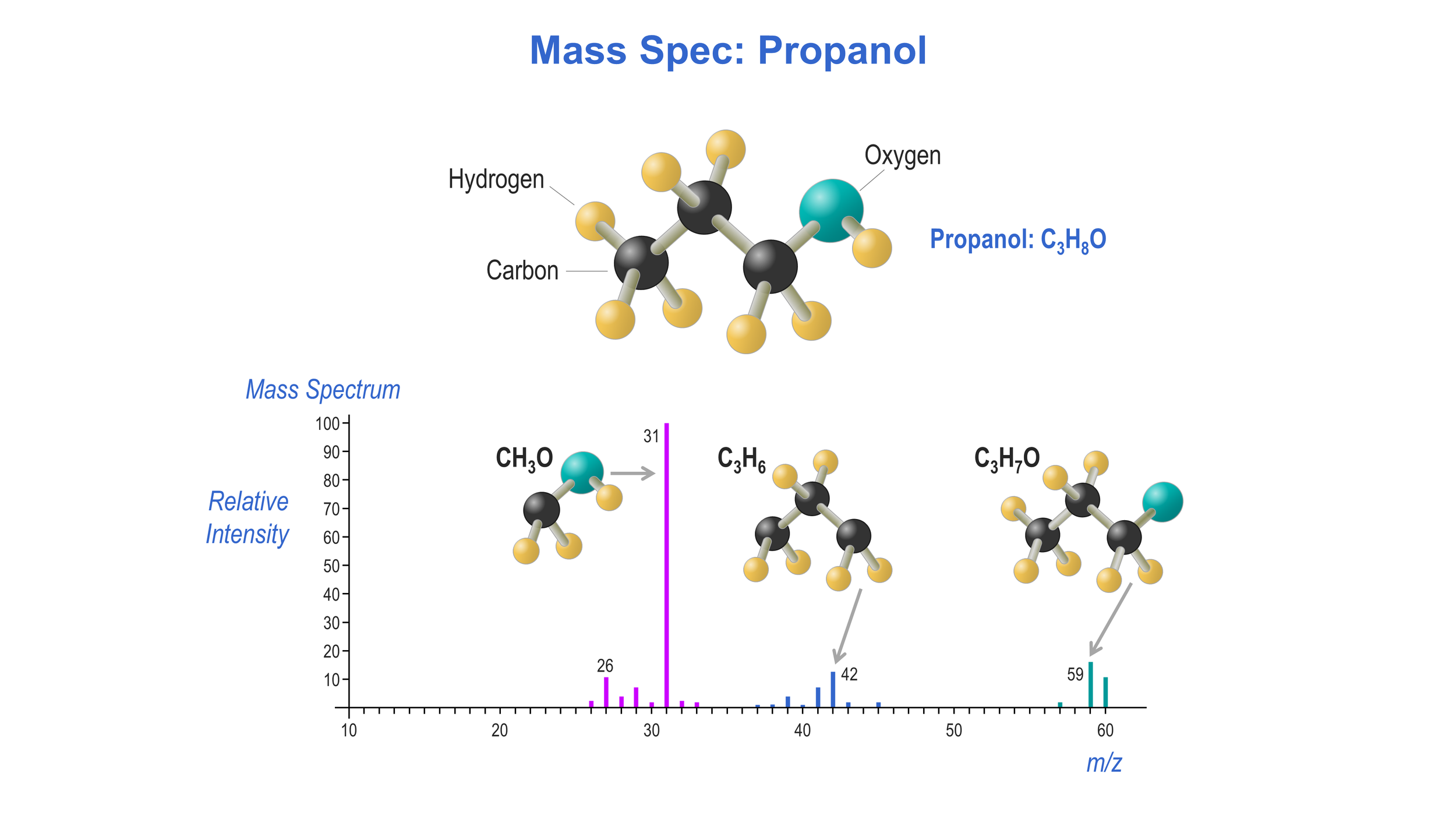
Here we use toy-like illustrations to model the molecular constituents broken out in mass spectrometry. The spectrum graph and chemical names will not be meaningful to most jurors, but all can understand the notion of unplugging different bits to create smaller molecules.
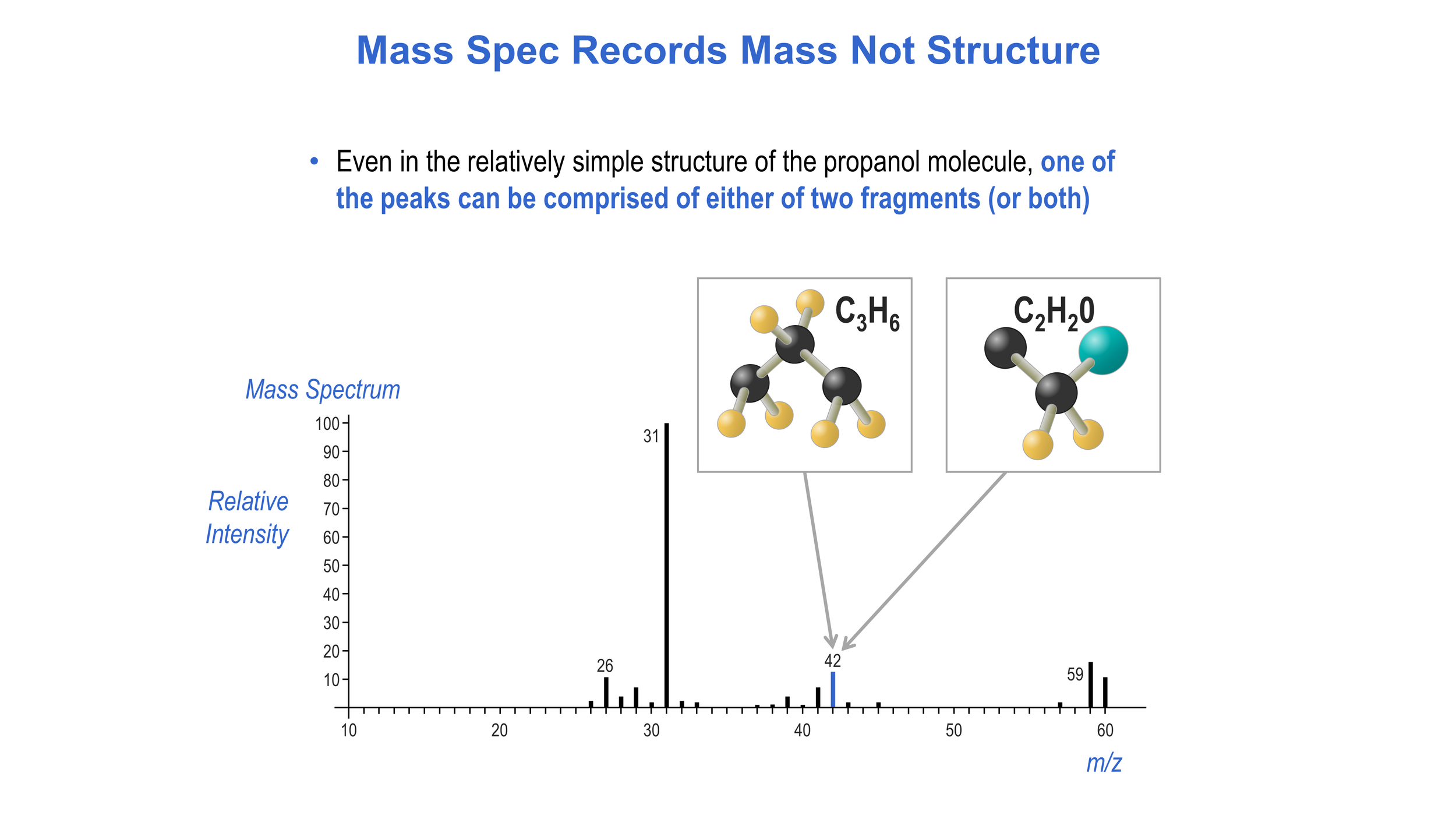
In the same matter, we continue with the simple models to show that a peak on the spectrum can show the presence of different chemical fragments that happen to share a particular mass.
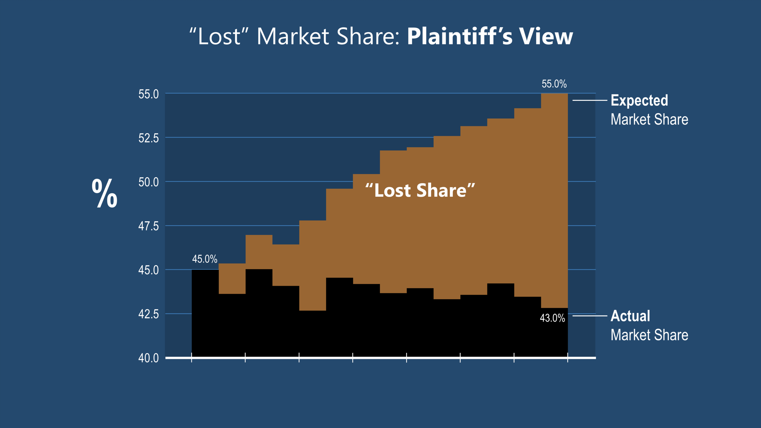
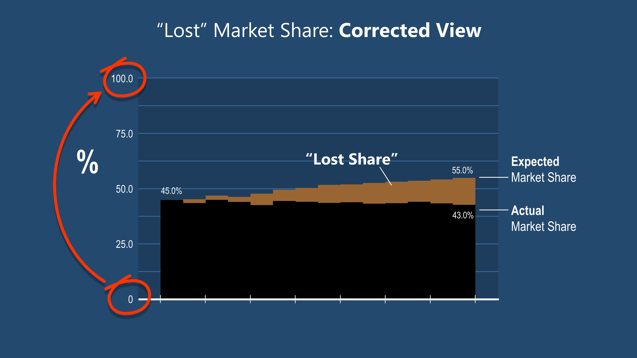
Whether by mistake or in an attempt to deliberately mislead, a plaintiff’s damages expert used a graph like this to show a seemingly huge “lost” market share. This creates an opportunity for the defendant to correct the y-axis limits, show a more accurate treatment of the data, then challenge the witness on cross.
What qualities make your graphics look good?
There is a wide range of style and philosophy in the world of “good” trial demonstratives. Some properties that distinguish the good are set forth below, and please note that some may overlap or even cancel each other out:
Accountability: A good graphic does not have cognitive barriers—that is, content or features that require probing thought from the observer to understand. At least some part of the mission of the piece should be instantly recognizable.

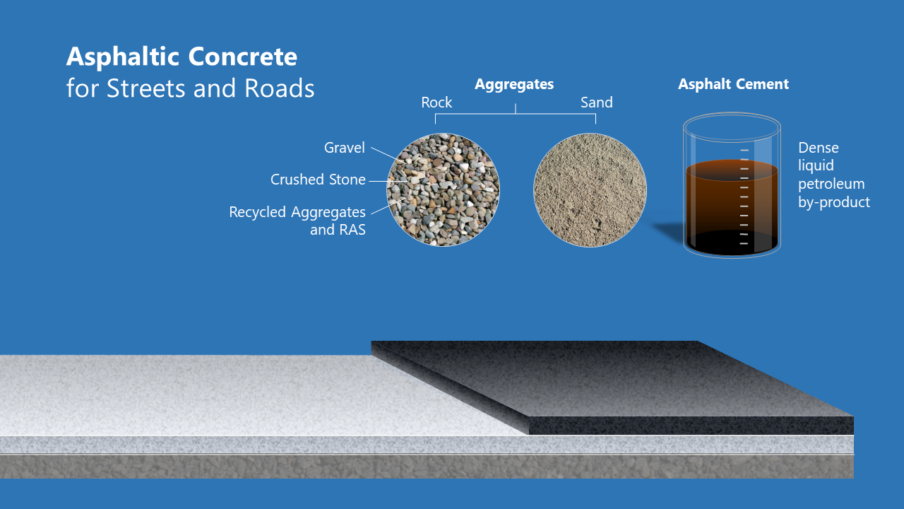
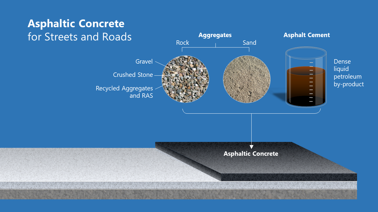
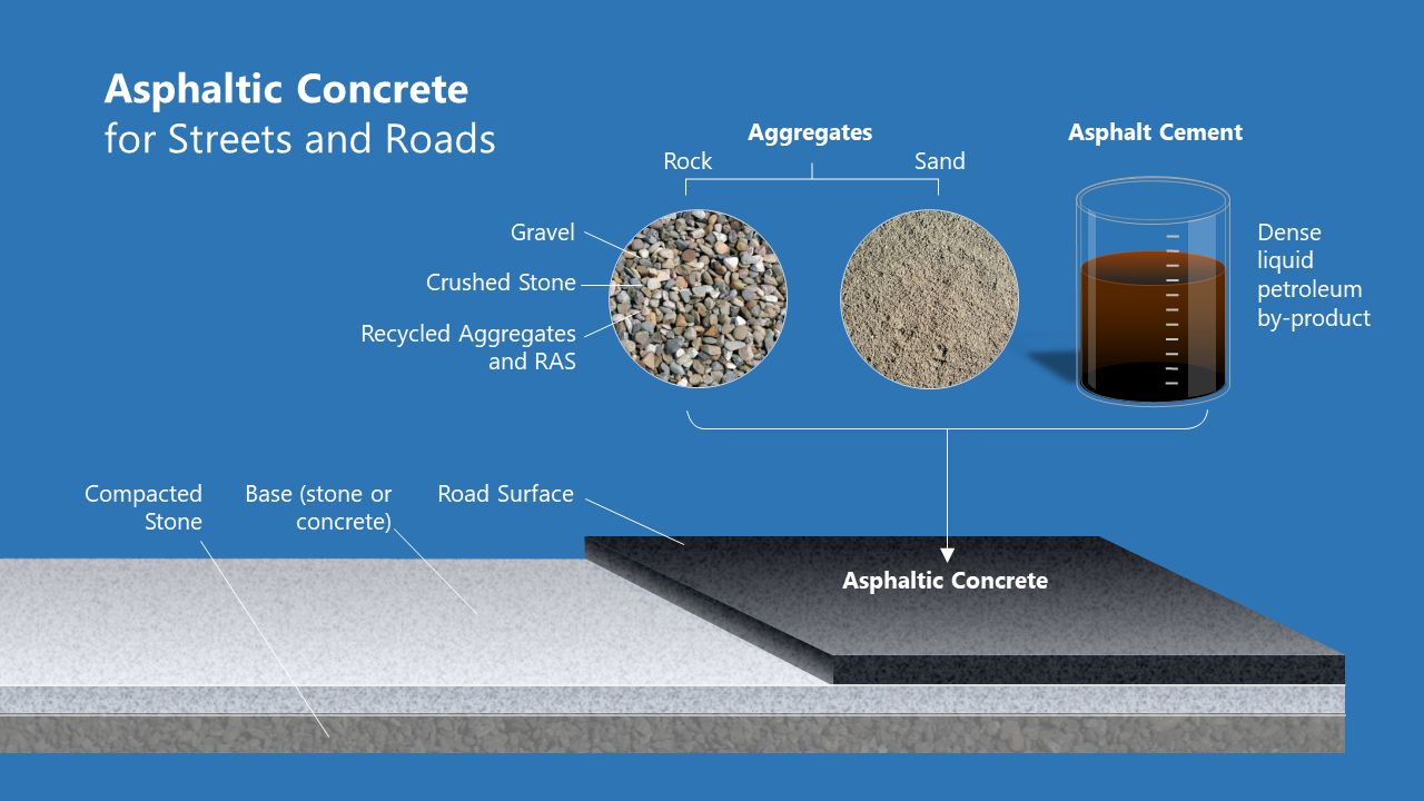
With progressive disclosure (building on screen) this 2D animated illustration demonstrates visual and data richness, while remaining accessible—that is—easy for the lay person to quickly comprehend
Visual Richness: This is a form of useful complexity that makes images more relatable and more memorable (see box on Park, et al.). Richness includes details and textures that reward deeper inspection, and which create a deeper impression.
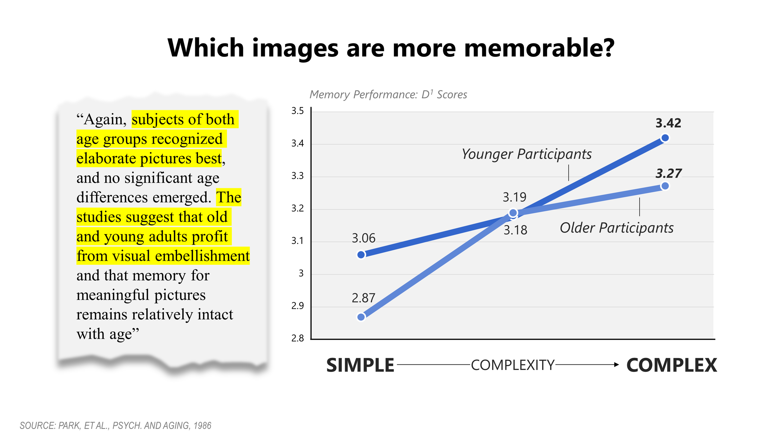
The findings of Park, et al in the 1980s supports my notion that less is not always more—and that jurors both recognize and remember information better when you show them a richer picture.
Data Richness: A Tufte principle, data rich images have lots of information arranged in a way that remains accessible while showing a level of complexity. Data richness includes the “indicia of authenticity” mentioned above, and those images communicate clearly that the author/artist has done their homework.
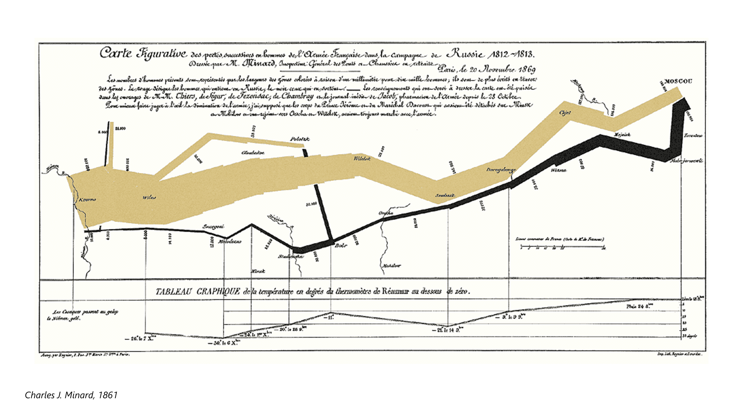
Minard’s 1861 diagram of Napoleon’s Russia campaign has been hailed by Edward Tufte as “the best statistical graphic ever drawn.” It offers a bold, instantly recognizable message (the decimation of Napoleon’s army) along with an engrossing set of detailed information, including time, location, direction and temperature—a great example of visual and data richness
Alignment: A good graphic is in alignment with trial themes and goes directly at proving trial objectives. Even neutral tutorial demonstratives should address content from the point of view of your positions. It generally is not subtle, and does not land glancing blows.


Animated 2D illustrations offer an attractive and economical approach to teaching persuasively. Graphics like this that are built in PowerPoint remain editable right up to the moment of presentation in court. This is a huge advantage with no penalty in viewer experience.
Illustration: Good graphics include professional illustration. Even a worn analogy can take on a degree of authority when rendered in a clean, academic style. Illustrations leave out things you don’t want to show and enhance those you want to emphasize. Don’t use clip-art.
Analogies pose challenges and opportunities. As a general rule, I suggest staying with a simple concept, and not “torturing” it, as there is always a breaking point. Visually, stay away from a cartoonish look, and keep it more academic or technical-looking.
Verbal content: A good graphic agrees with what you’re saying, and uses brief, memorable headlines, quotes and labeling. Progressive disclosure with mouse-clicks keeps everyone on the same page, but nobody likes big slides full of bullet points.

The verbal content of your graphics is important, and must not be overlooked. Building on mouse-clicks, titles, labeling and legends adds meaning for your audience, and effectively provides cue cards for you and your witness.
Fits presenter style: This is the number one indicator of “goodness.” The lawyer who really owns their graphics tends to present them in a way that works — and might just work for them alone. We have clients who are visual “Calvinists” — they eschew every design element, ornament or enhancement. Their demonstratives are completely plain (mostly black and white) — and they almost always win. And we have clients who push the envelope in the other direction, using lushly illustrated analogies and other elaborate devices — and they win just as often. Whatever place along the spectrum our client comes from, I endeavor to create good graphics that particularly fit that presenter’s style.
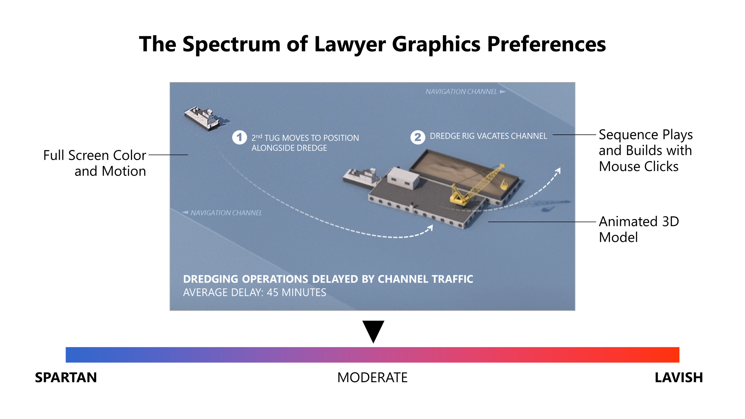
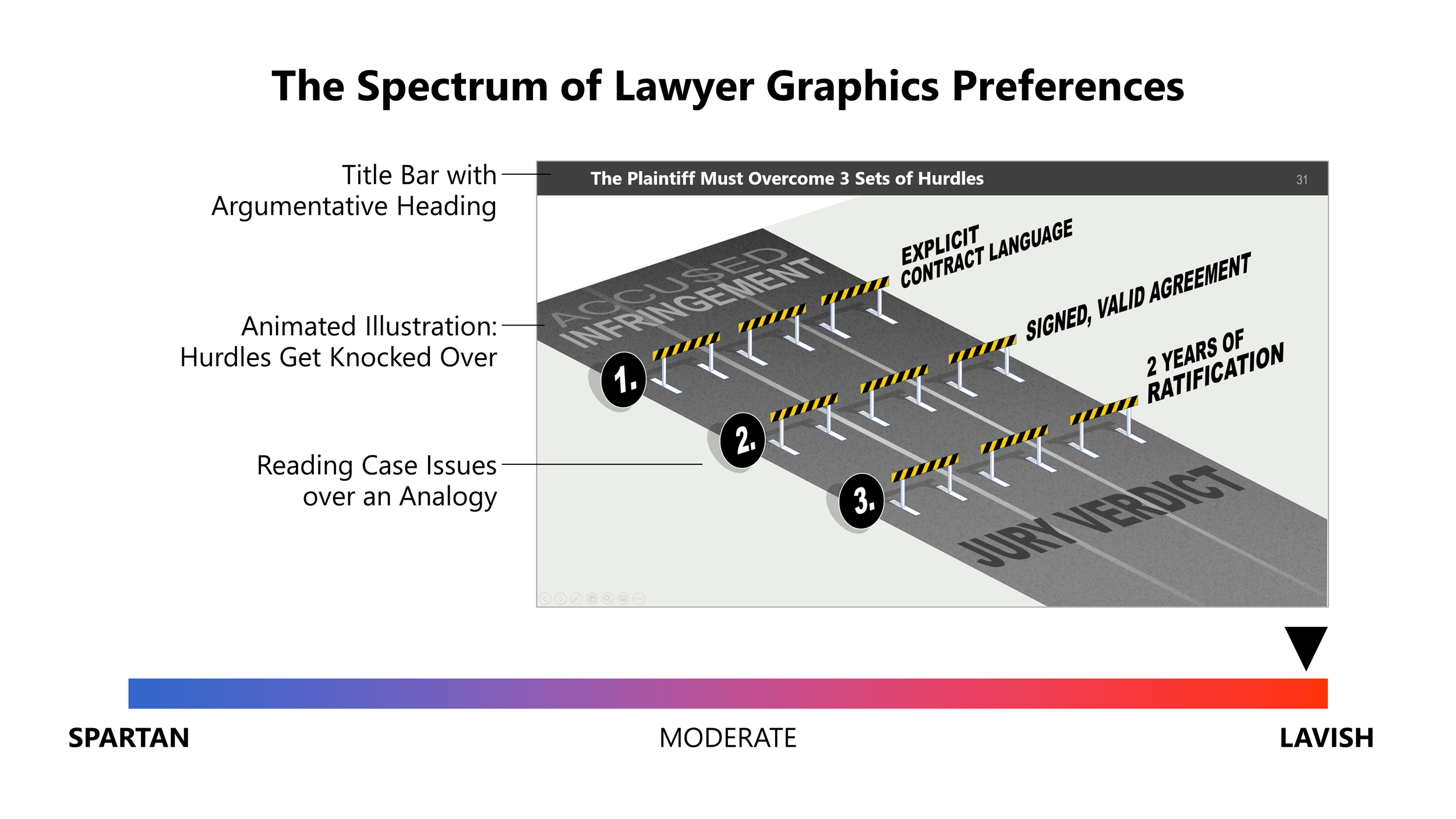
Some lawyers prefer plain graphics with no fancy formatting. Most occupy the middle ground, using illustrations, photos and animations with some color and neutral formatting. And some like to use more elaborate illustrations, animations and visual analogies. In my experience, when their graphics fit their styles, they are all right.
Our team specializes in developing graphics that capture complex issues and present them in a simple, clear way. Contact us to learn more about how we can help.